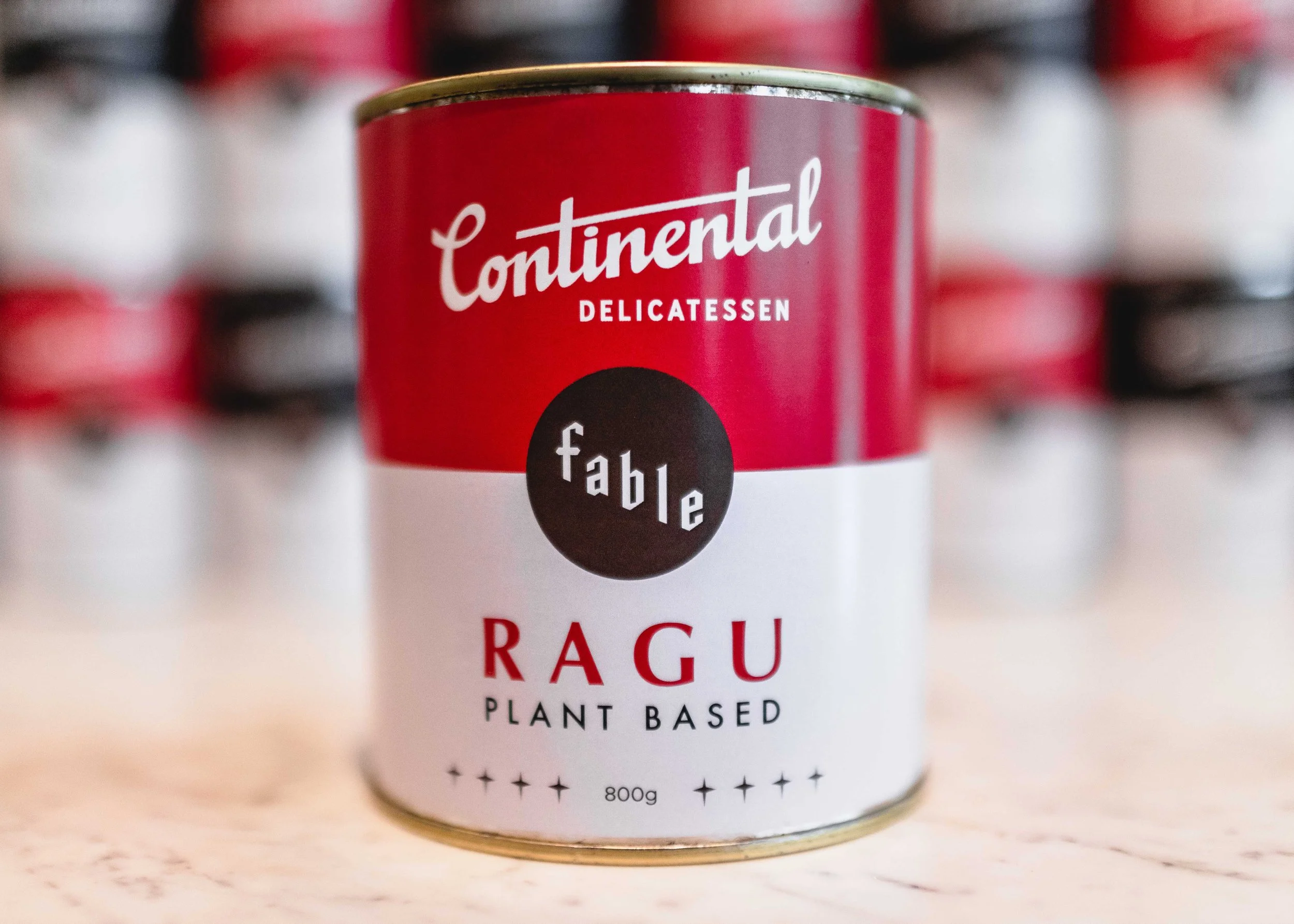
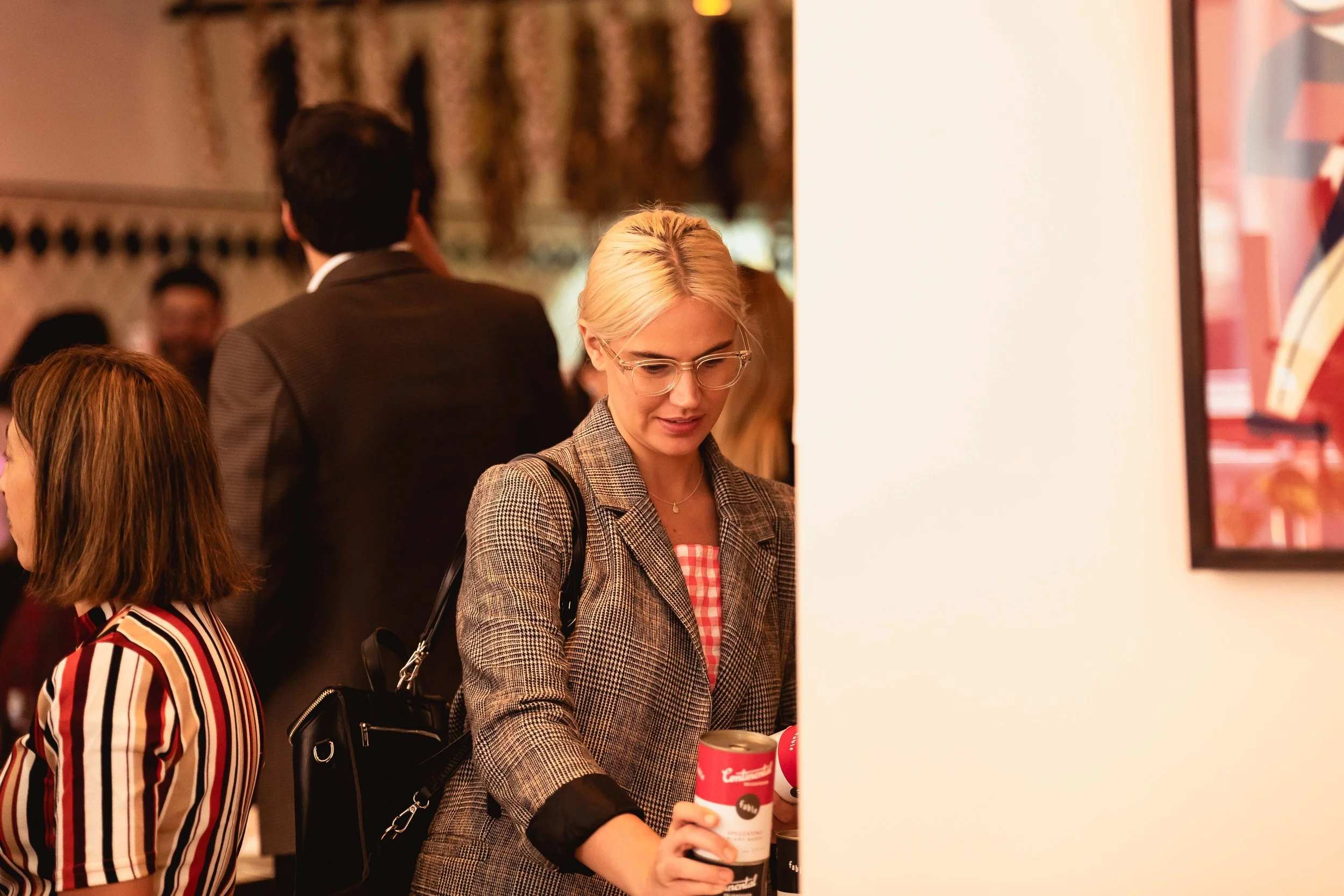
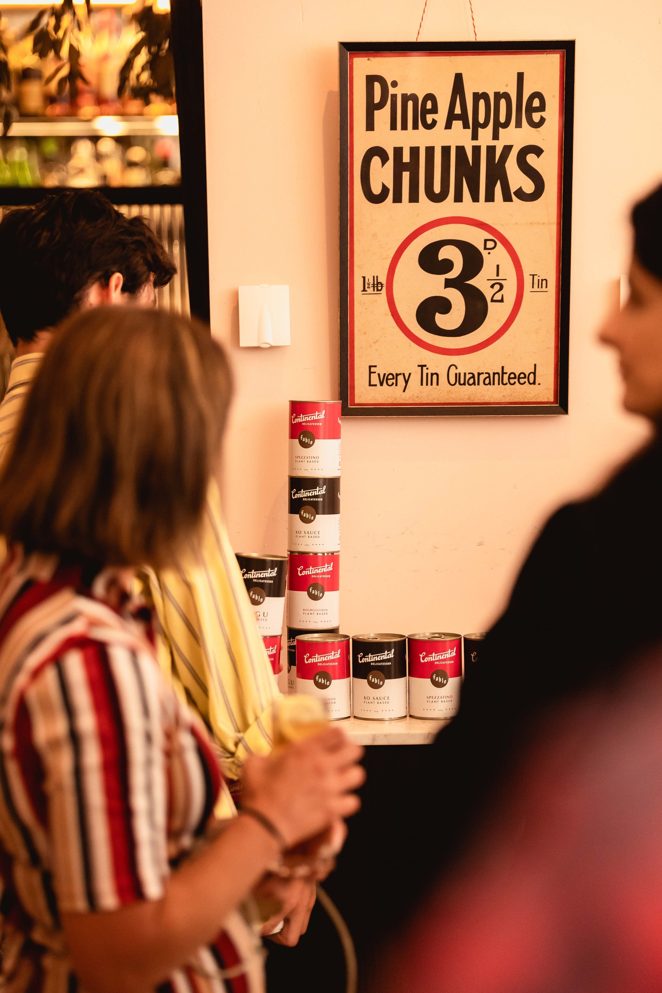
Fable is at the forefront of healthy mock meat. They entered into a booming marketplace of meat alternatives as a premium, yet accessible brand.
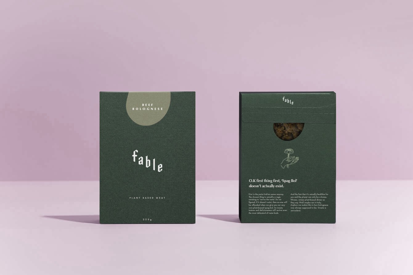
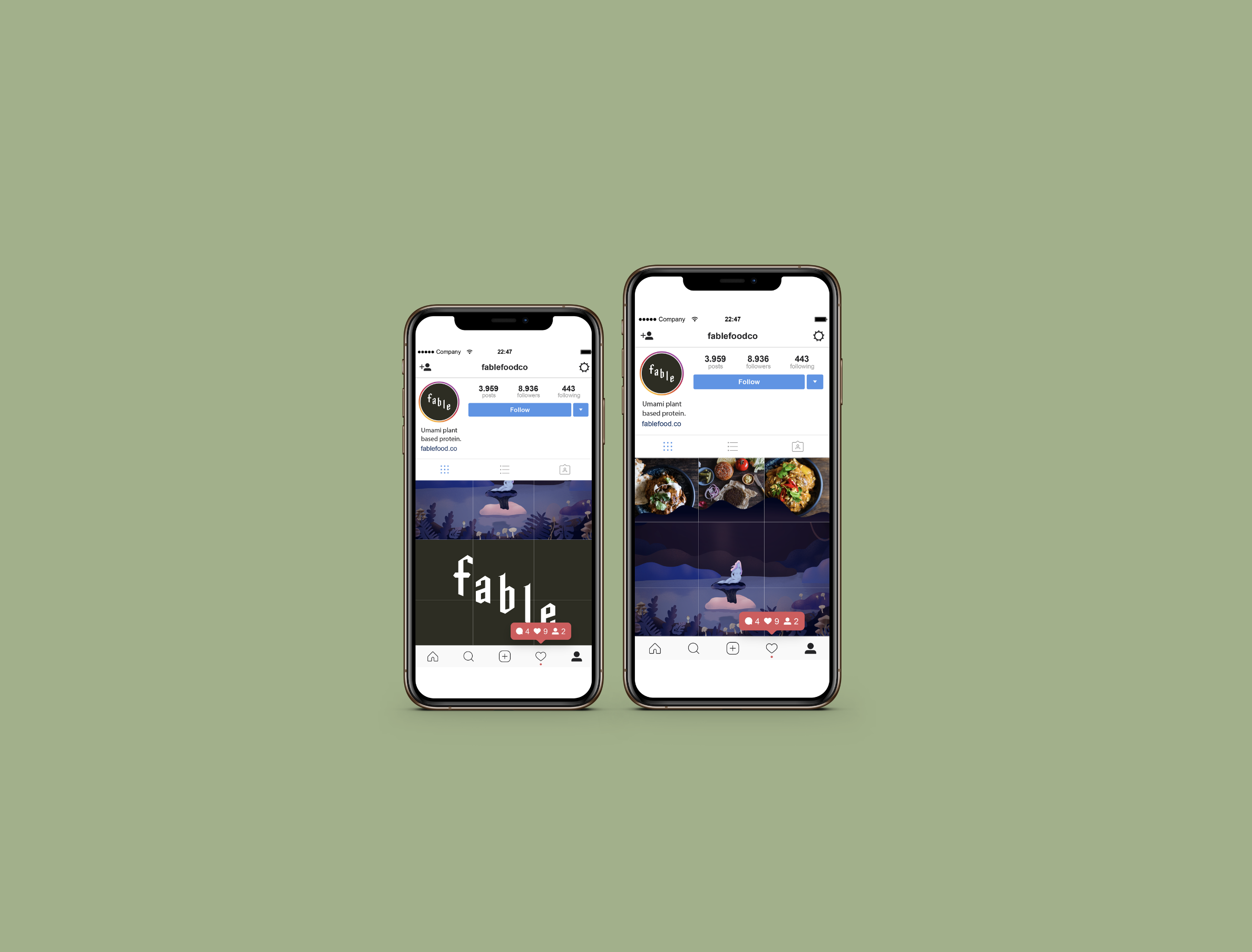
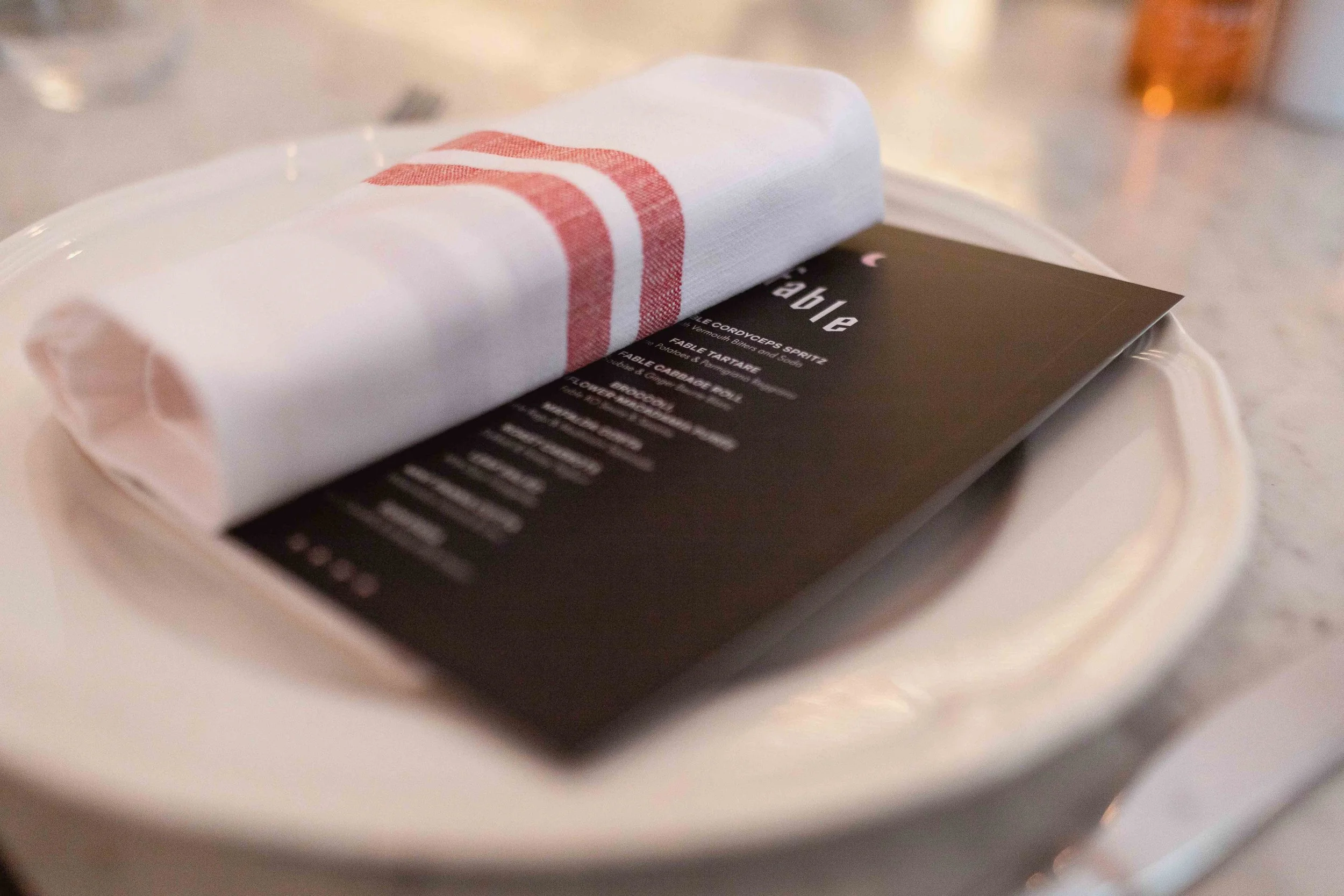
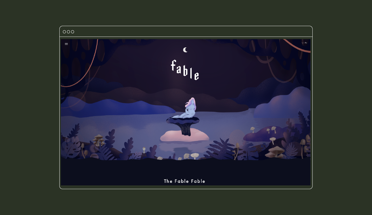
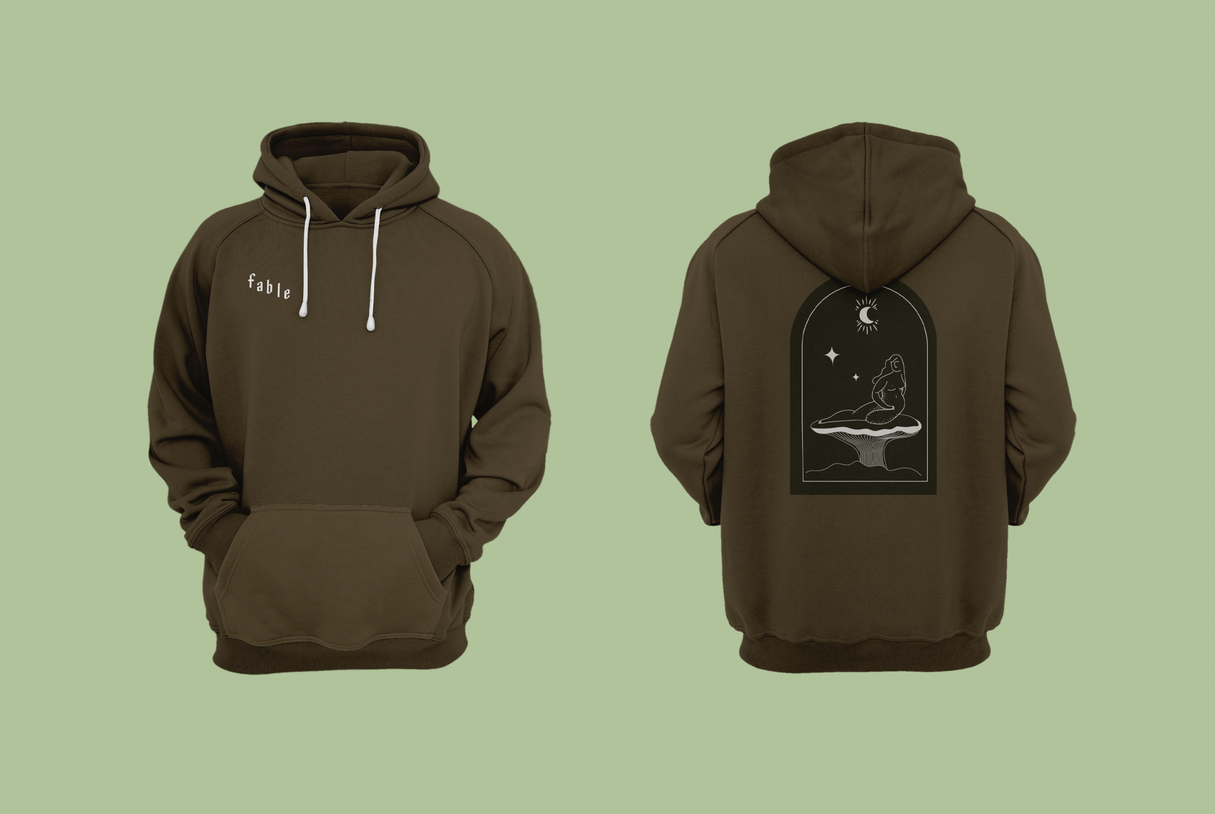
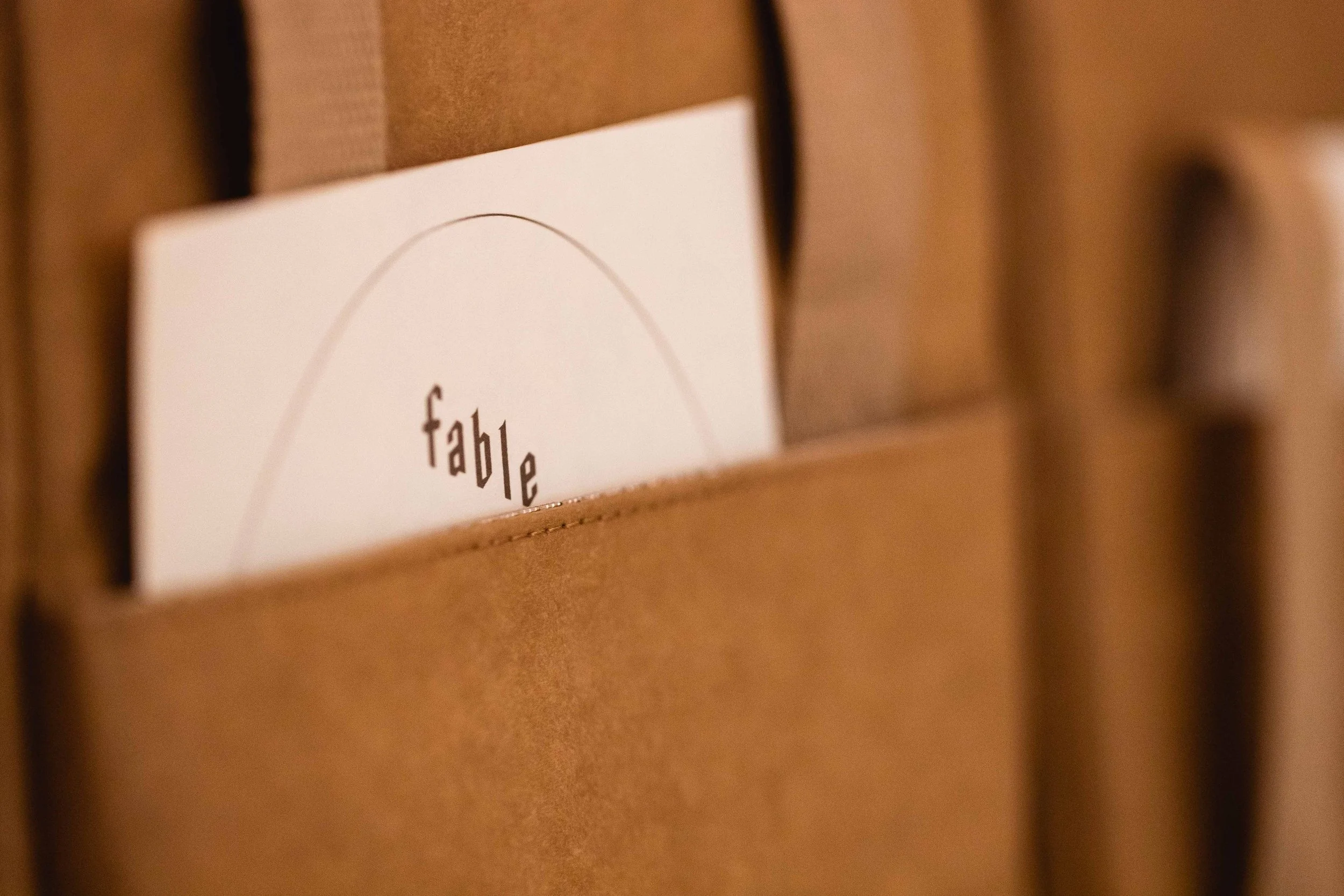
The branding needed to be unusual and refined but also speak to the history of storytelling (and thus our name). Our core wordmark was created to sit on an angle - this allows it to always own a spatial hierarchy. The letterforms were designed to feel trendy and relative to a Gen Y consumer whilst also tapping into a historic medieval aesthetic.
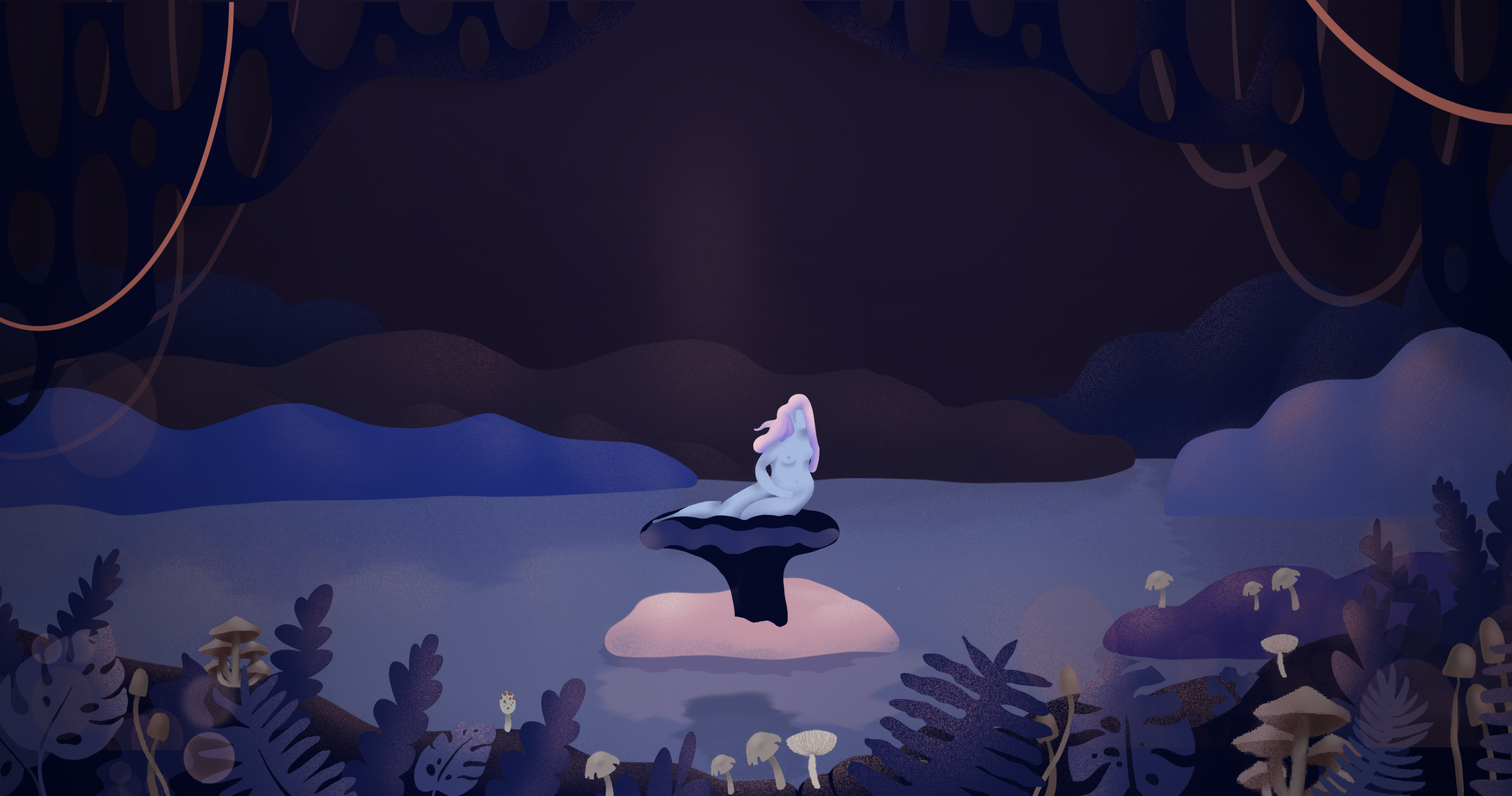
Our illustration and colour palette was designed to feel at home in a folk style story. All the illustrations are hand generated and somewhat naive to mimic the fairytale tomes from years past. Our palette is natural and earthy. This helps the brand separate itself from overly manufactured meat-alternatives.
