TYPOGRAPHY / ART DIRECTION / CREATIVE LEAD / COPY
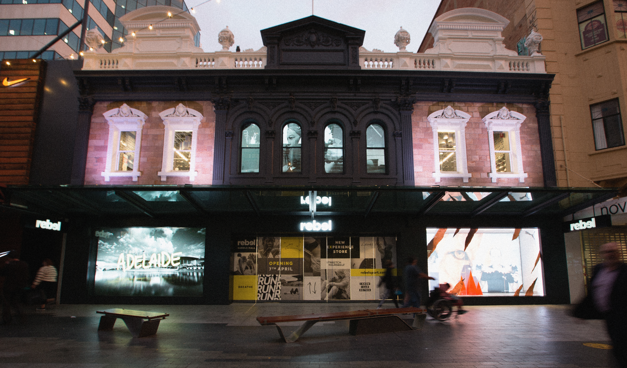
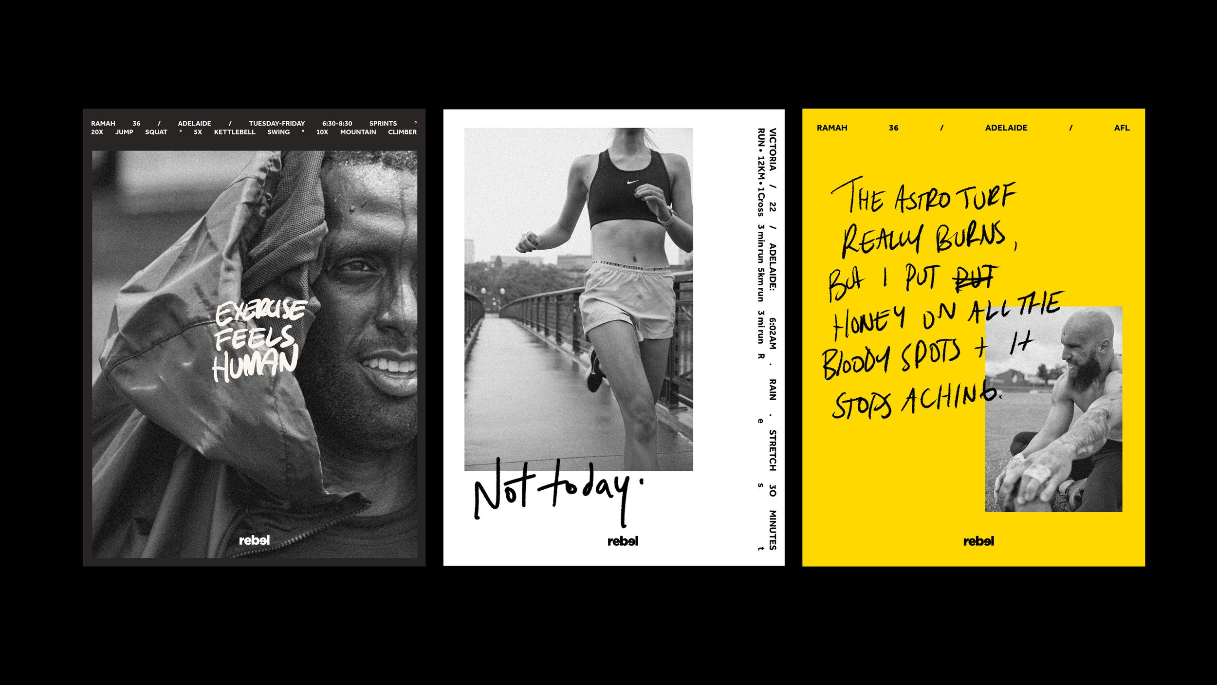
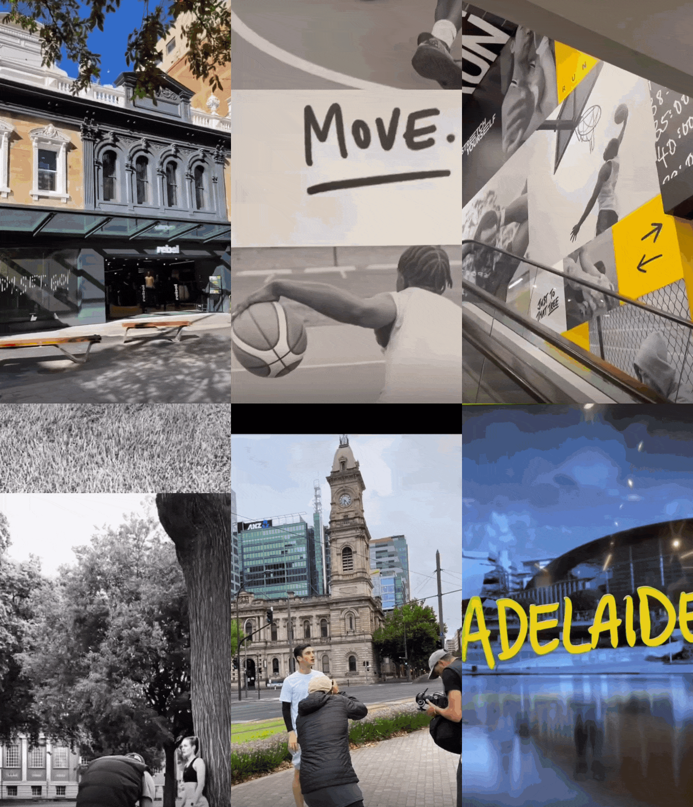
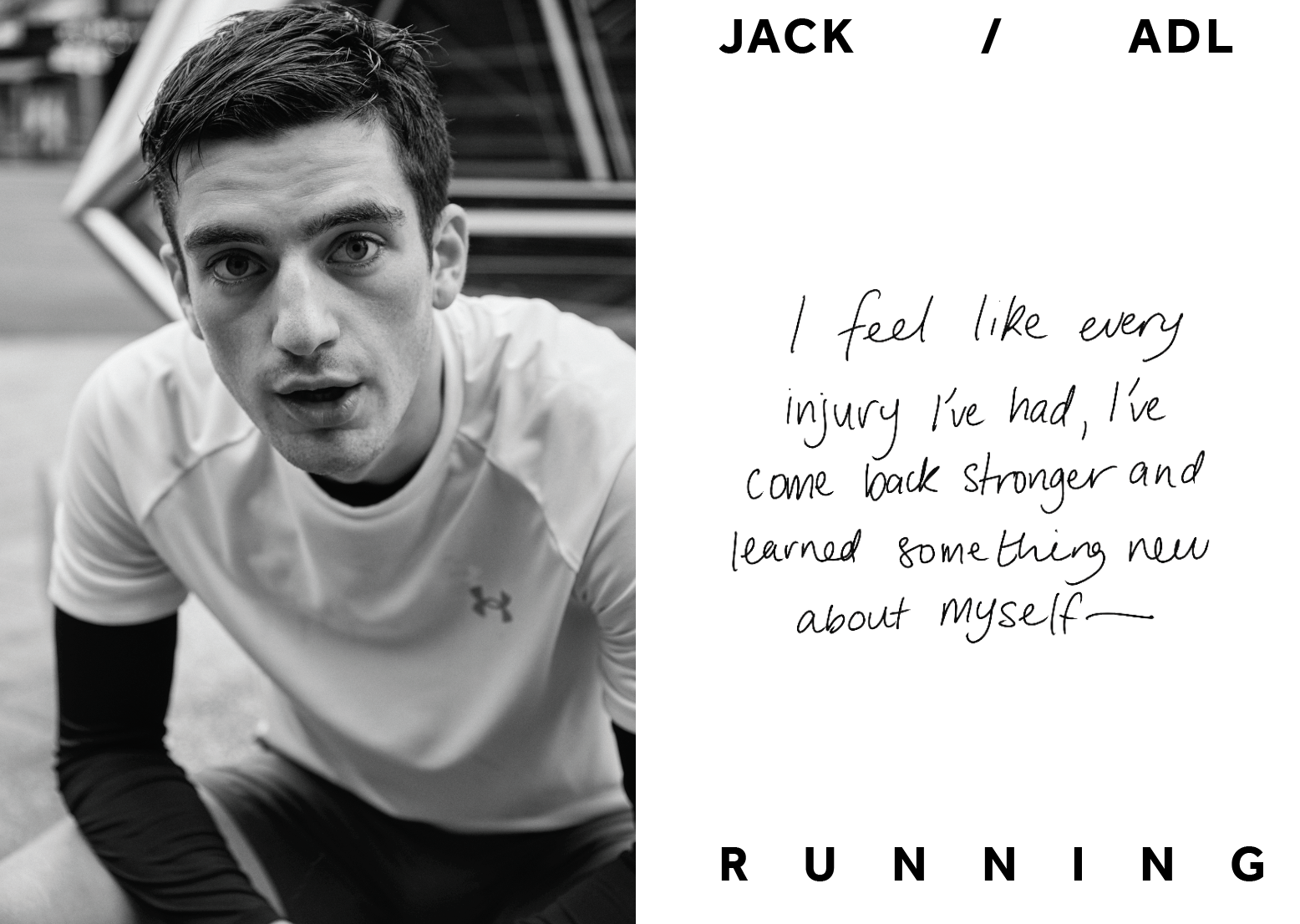
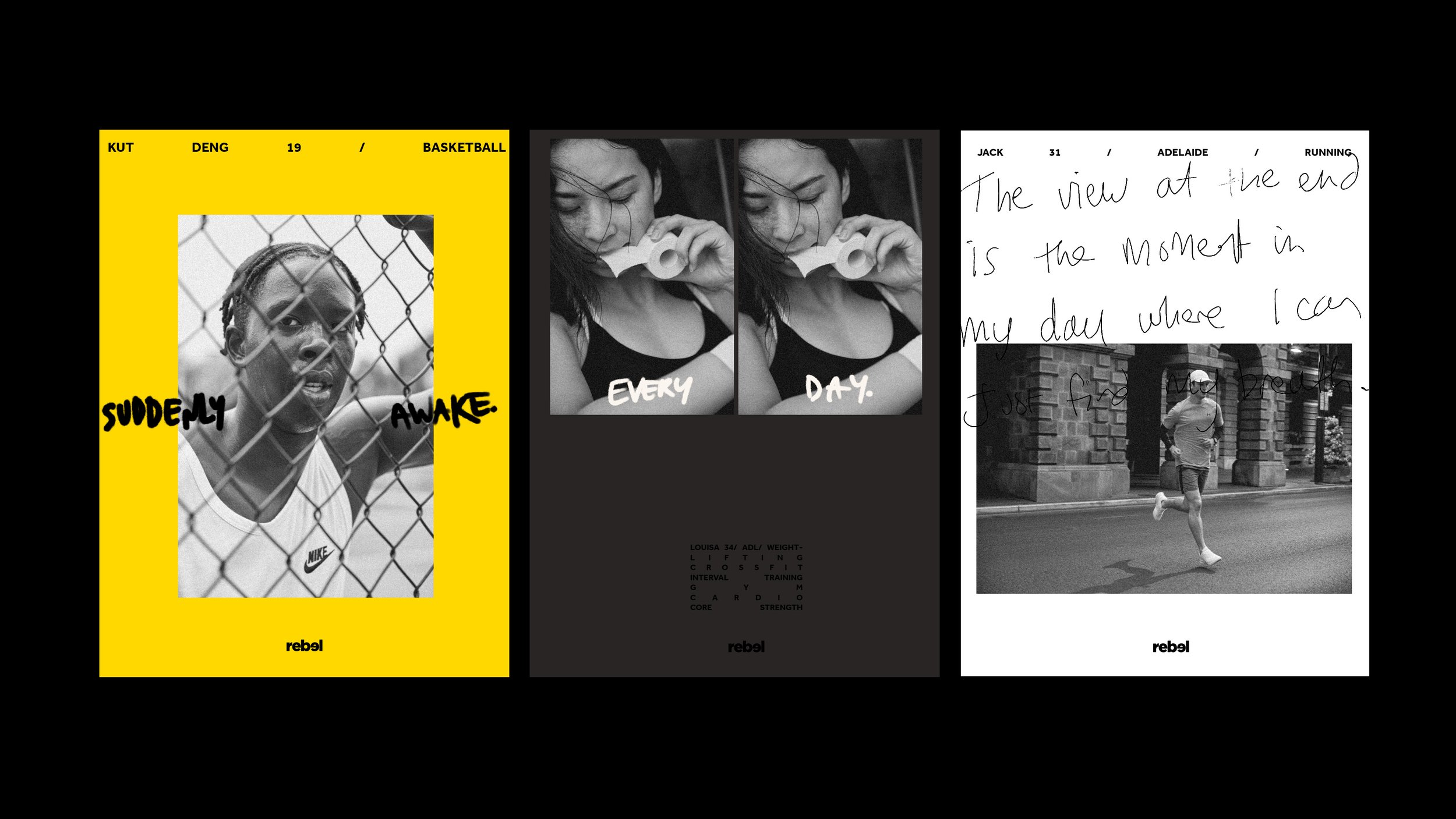
What does the REBEL tagline "SPORT IS CALLING" mean? We all have an individual answer for how sport calls us, each of our responses is creatively unique. Professional local athletes to yoga mums, the answer is always coloured by the individual's unique handwriting. This concept draws on the local personalities that engage with each store and celebrates their answer to “Sport is calling...me”.
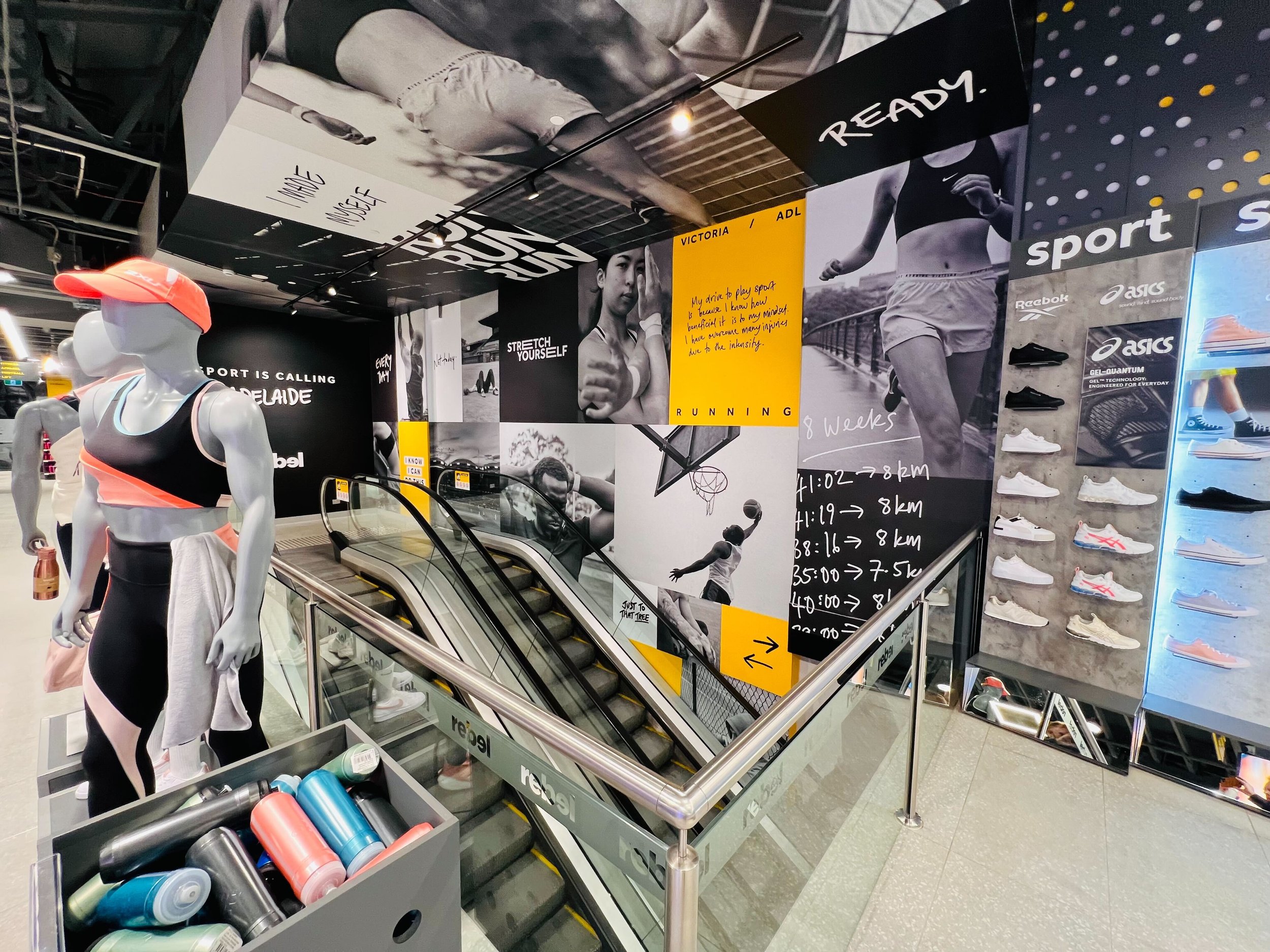
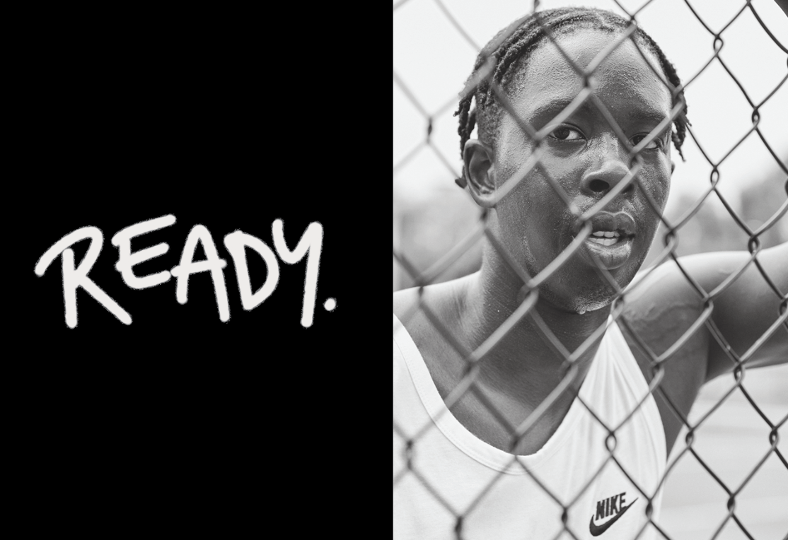
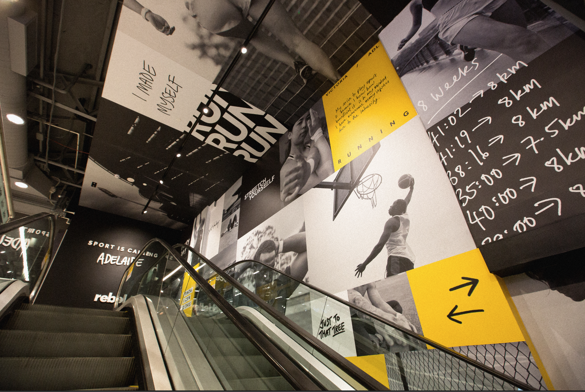
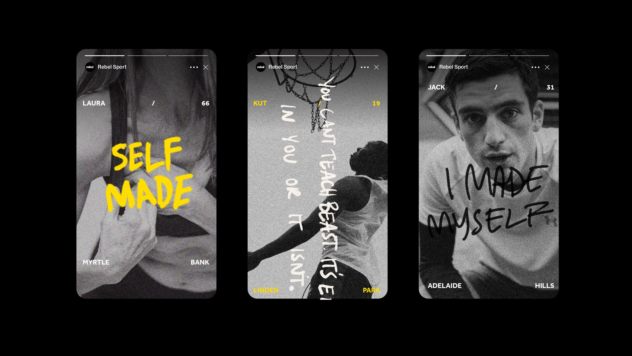
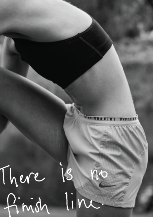
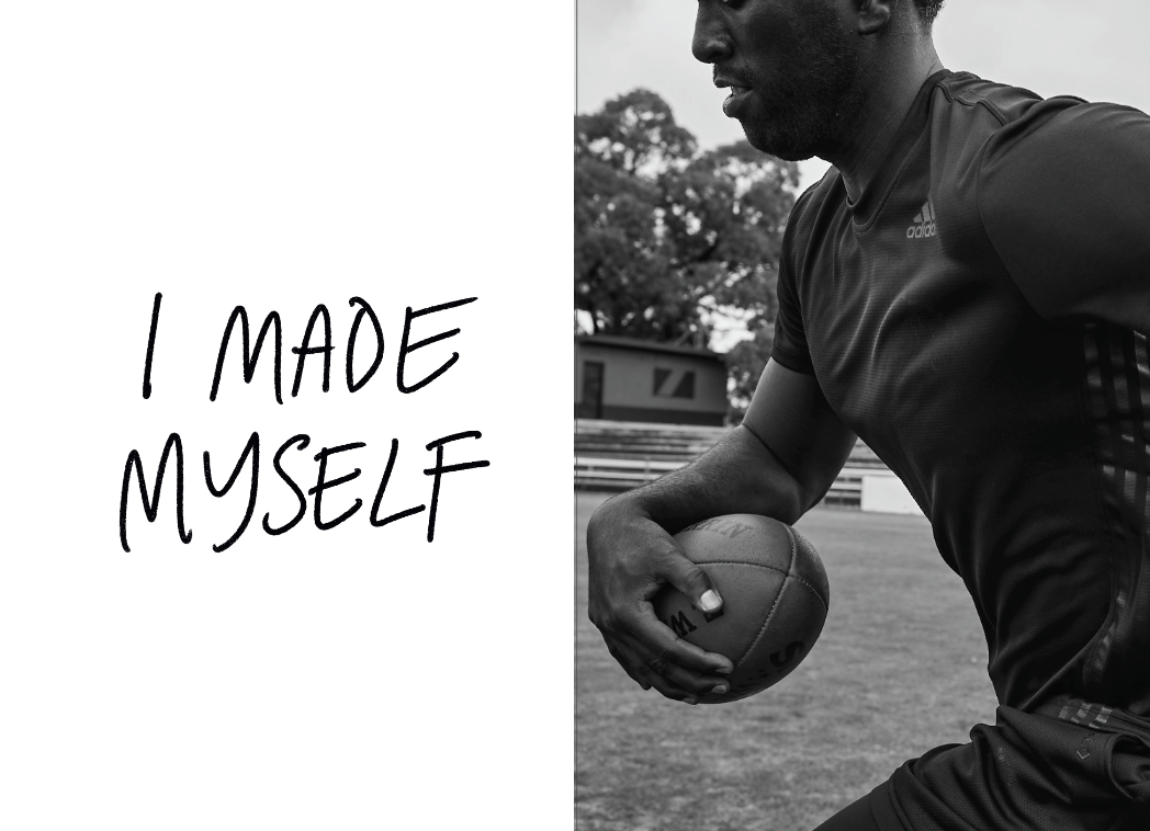
Using monochromatic and grain heavy imagery we wanted to capture something raw, unfiltered and authentic. This was not meant to be about creating aspirational sporting imagery, the narratives and imagery for each personality depict the honest and sometimes struggled look at how we view sport.
We created hand generated text and graffiti to capture the rawness of our campaign and to emphasise the personalities of each of our talent.
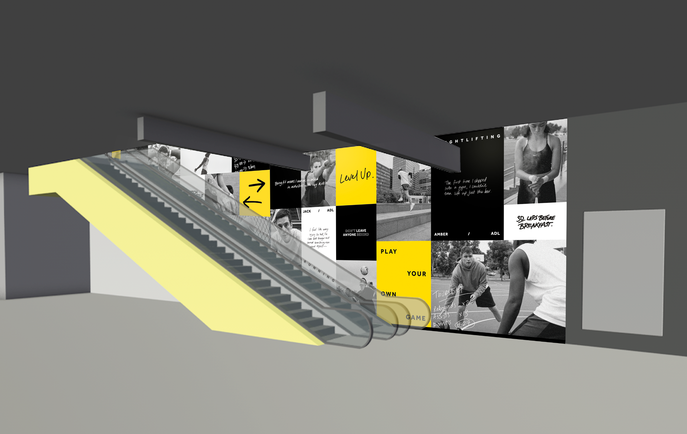
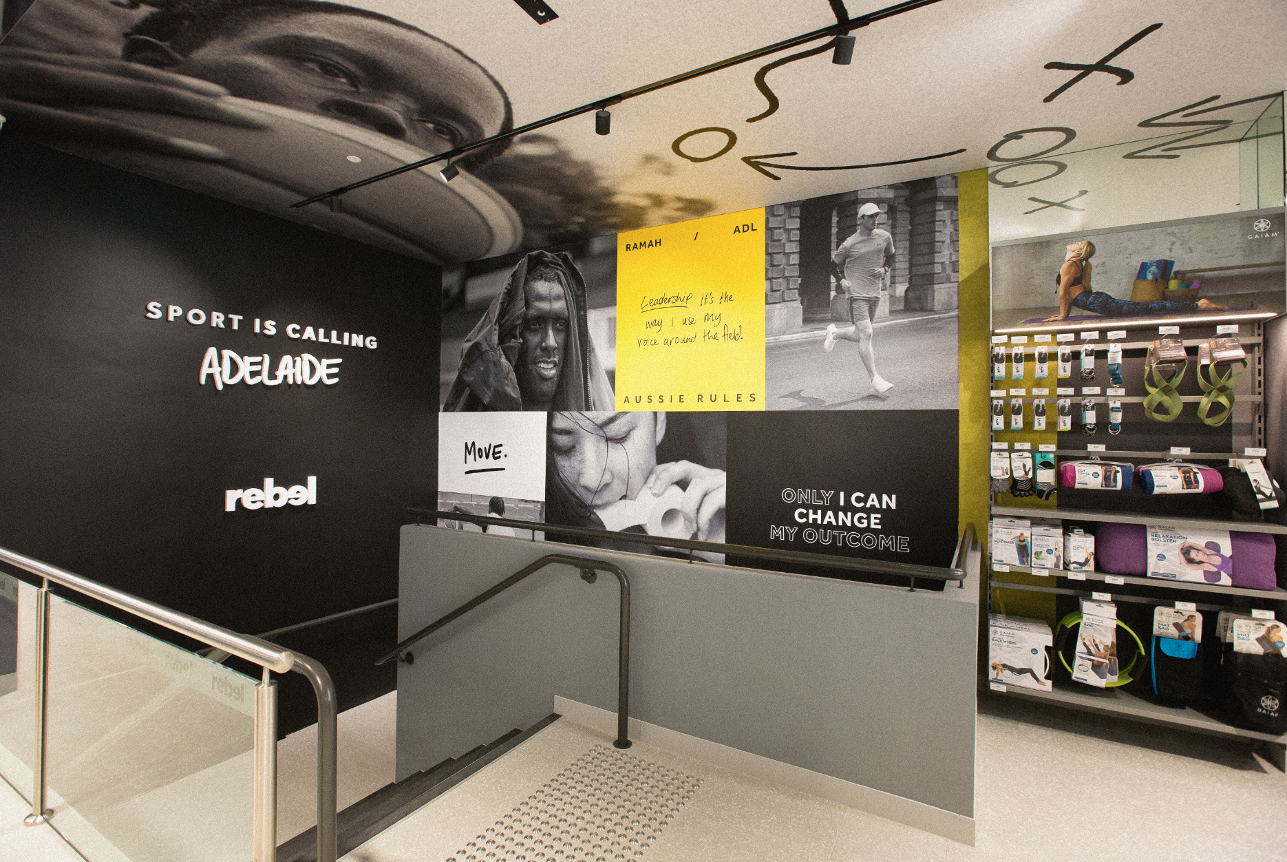
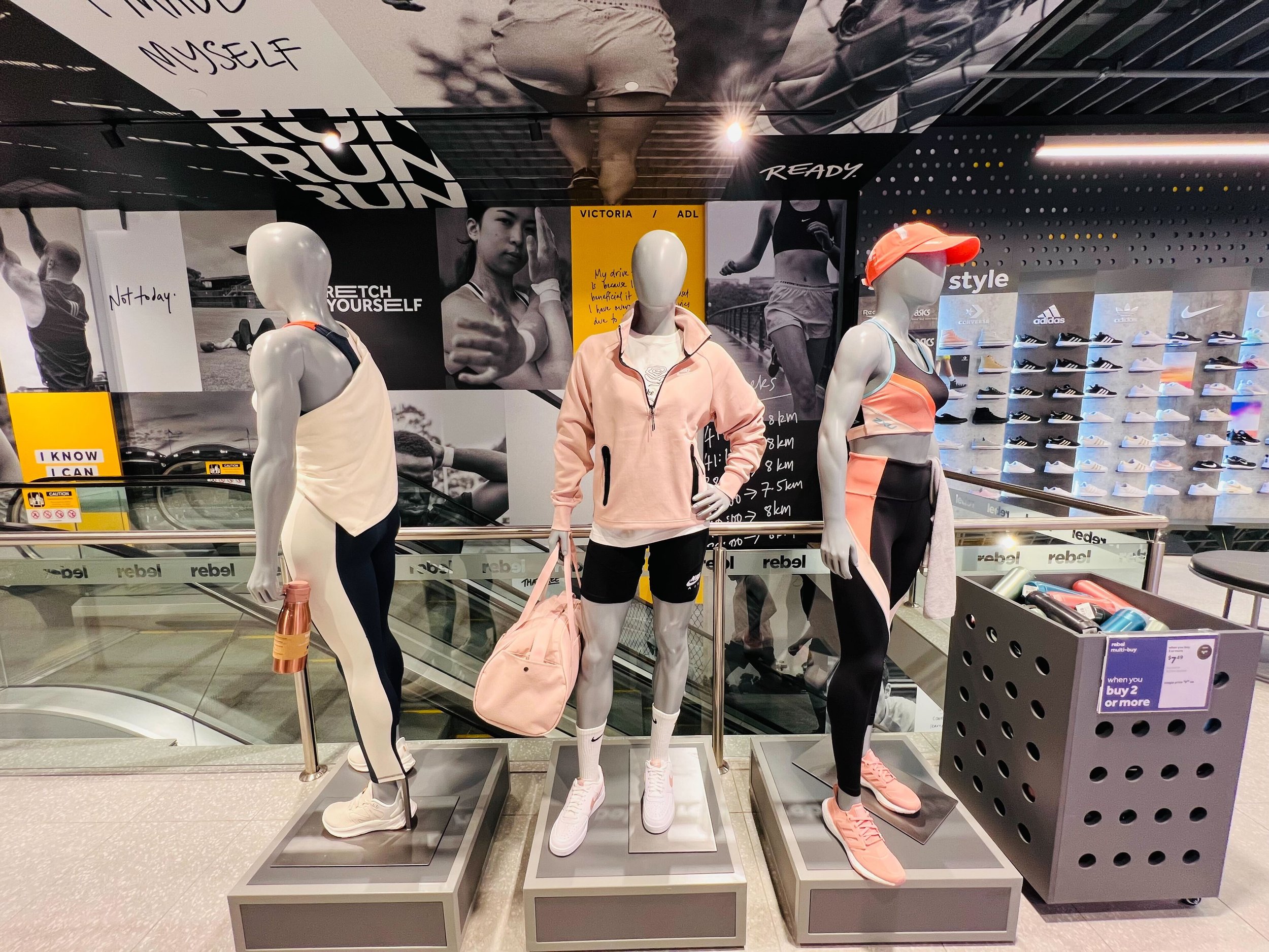
This concept is integrated and unique to each locality, allowing a vast and diverse response to the campaign. Not only will REBEL scale the campaign nationally across their flagship stores from 2022 onwards - they have also integrated a number of elements from the campaign into their permanent brand platform.
When REBEL asked us to create a graphics approach to their Adelaide store, we responded with a campaign that they are now implementing nationally across flagship stores.
