CREATIVE LEAD TEAM / BRAND IDENTITY / ART DIRECTION / WEB / DIGITAL / ENVIRONMENTAL DESIGN
Till is an integrated payment system that simplifies complex financial solutions.
Till needed a brand identity that cemented their place in the fintech world and gave them enough versatility and engagement via a number of different channels.
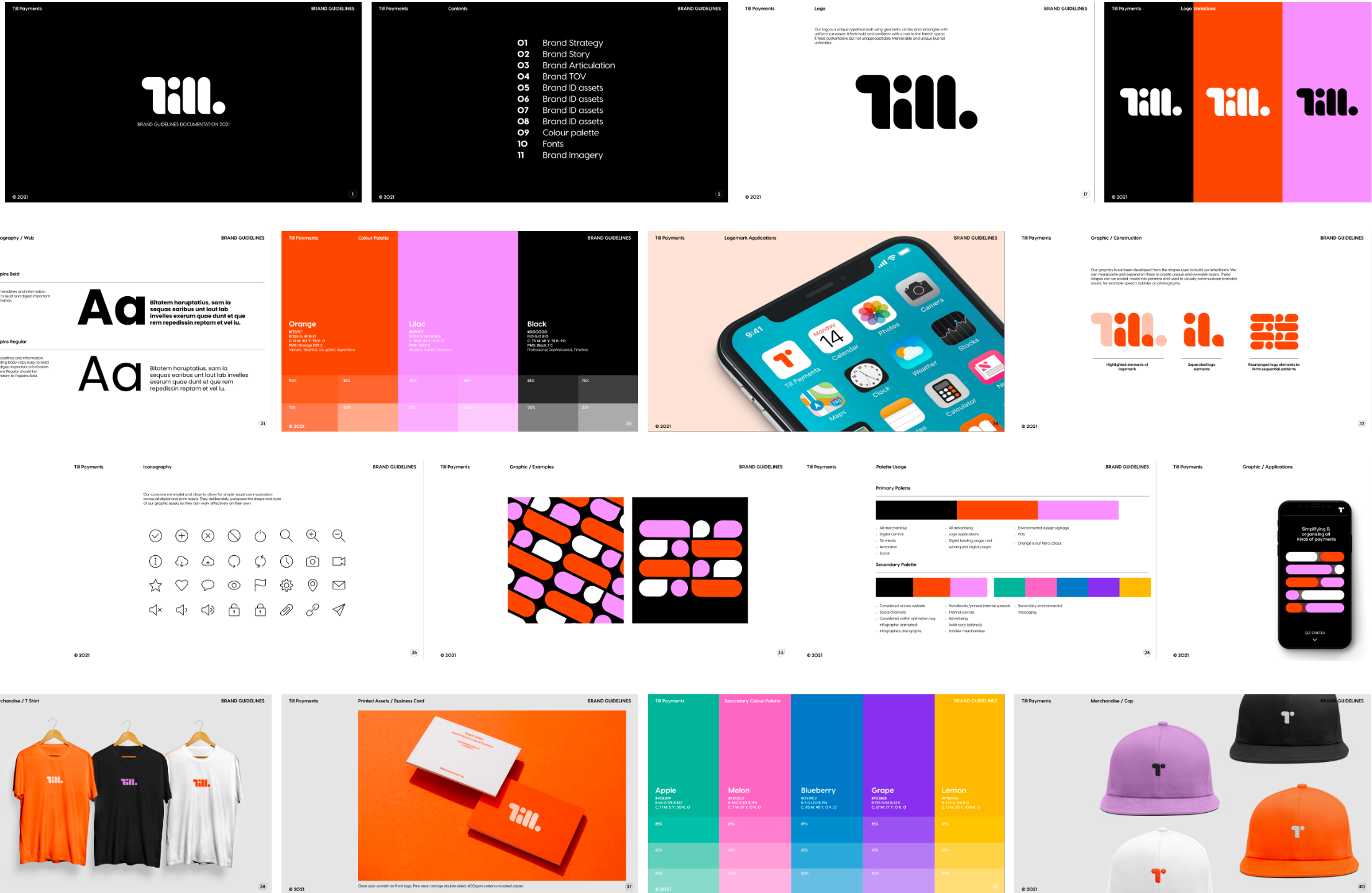
When we were engaged to design their rebrand we focused on three main pillars. Simplicity, confidence and progression. This meant when designing their logo, we removed the word “payments” to simplify and build equity behind one core icon.
We developed a custom logotype built on the geometry of the circle (or coin). Referencing Till’s place in the fintech world, and the ebb and flow of an abacus.
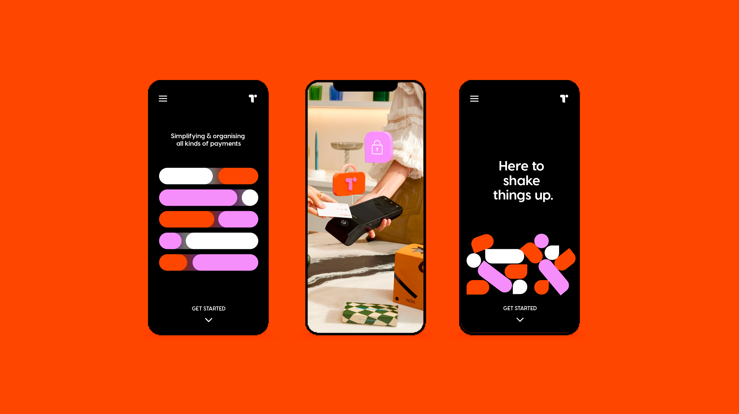
A progressive and energetic (and gender neutral) colour palette was created to ensure increased brand equity, cut-through in marketing and a point of difference in a flooded fintech landscape.
Using our palette and logo we have created a versatile and unique graphics library. This comes to life in motion with looping shape and logo animations, creating a flexible, modular, always-moving brand system.
This job was undertaken at The General Store in collaboration with Reeshma Banji.


