CREATIVE LEAD / BRAND IDENTITY / PACKAGING / SIGNAGE
Burger Urge have always hated the big fast food retailers.
They have used their public platform to “poke the bear” by mimicking products, using extreme imagery, obscene language or even just random stunts of provocation. This attitude has seen them in and out of litigation for years — but grown them a strong army of followers who admire their rebelliousness.
So when we were approached to design a new brand identity the answer was something a little off the wall.
Our brand identity was deliberately very anti-brand. We removed as many wordmarks as possible, using only our graffiti smiley face across signage, packaging, social and comms. We updated all brand imagery to be piss takes of popular culture, tapping into a real Aussie sense of humour. Our tone of voice became very direct and almost offensive. All the while the brand continued to grow exponentially.
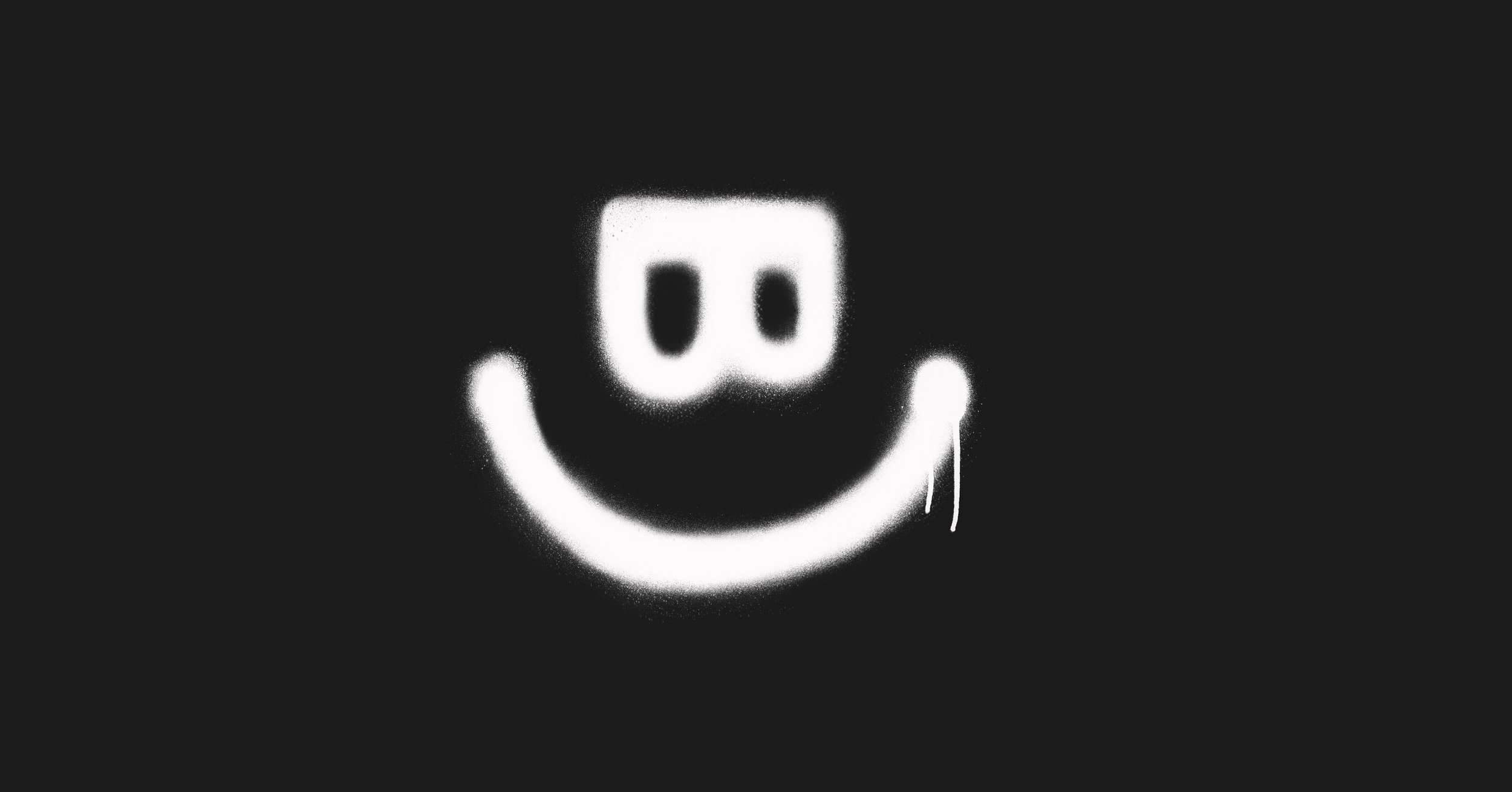
The B and the U from Burger Urge was used to create “Smurgy”.
Always morphing and changing depending on the mood, Smurgy represents the brand in the most minimalist of ways.


